Quote:
Originally Posted by DwnWthVwls

I think that first example is pretty awful and the second is actually amazing. The style can just get muddy at times without good contrast and texture.
imagine those drawings with this coloring:
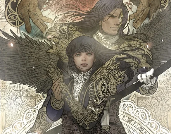 |
Meh. Notice where all the high detail stuff is there's monochromatic coloring, and where ever there is color variance it's clearly computerized shading. If the art showed stuff that would need different and distinct coloring among all that detail not only would it vastly increase the time necessary to color it the coloring would probably end up looking very busy and garish and so you would need to dial down the detail.
And also the artwork itself is far jankier. With all that detail you'd expect more exactness in linework and yet there is plenty of squigglieness and lack of symmetry that I would put down probably to lack of time than any kind of artistic statement. The blessing and curse of Berserk is that it's released whenever Kentaro Miura decides to release a new chapter, which means long delays but artwork of the utmost exactitude.