Here's a cool graphic that shows the proportion of global debt per country:-
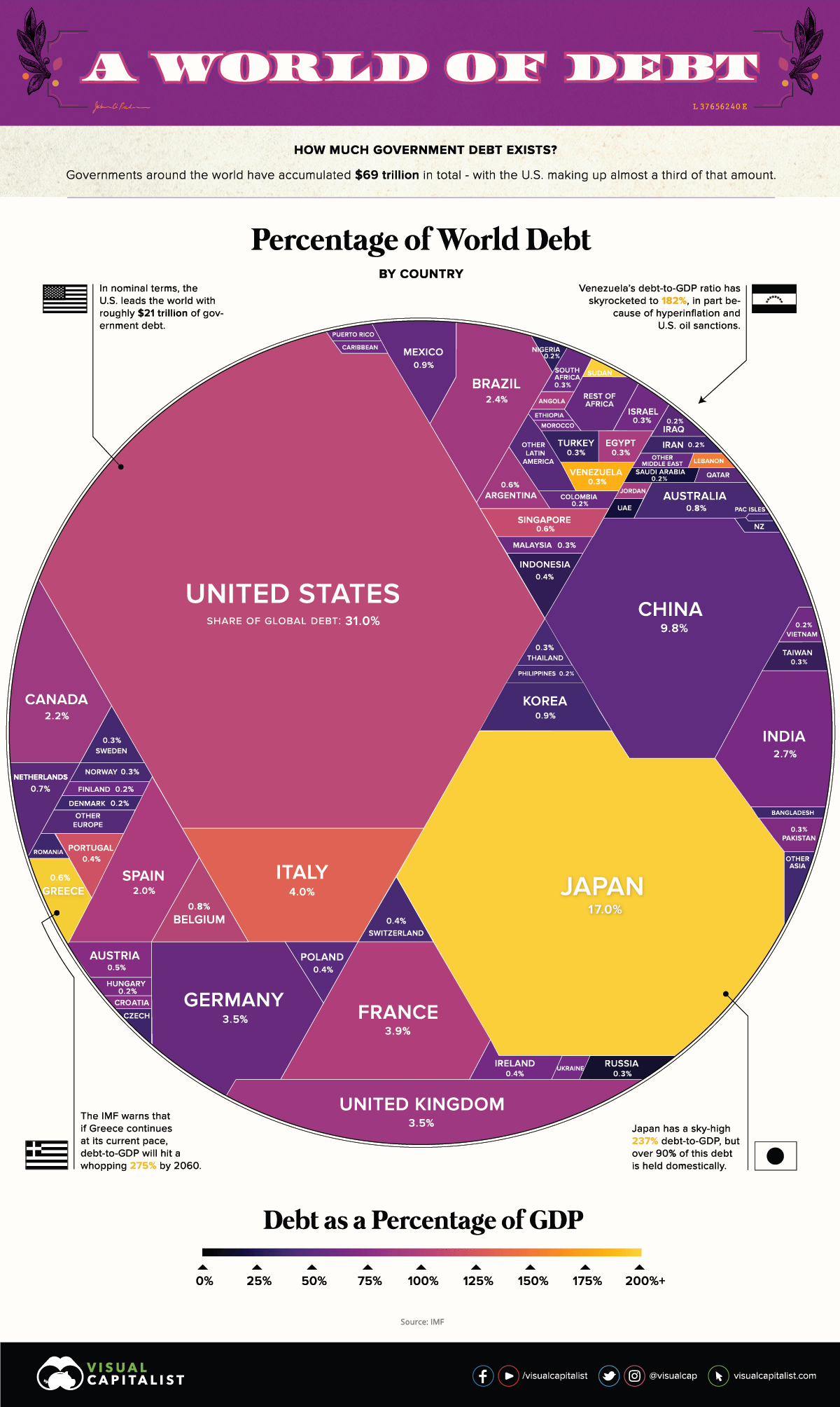
America, naturally is a big chunk, but to see a country's debt vulnerability you have to check its colour with the horizontal scale at the bottom; the countries in bad shape are the yellow ones. They are the ones who can't afford to borrow their way out of the covid economic crisis. Although a little closer to yellow than Britain, the US looks ok at a glance.
Of course as we know from personal experience, the significant thing about a debt is how you spent the money. A student loan or a mortgage on a house is with luck a good investment; a debt incurred because you fancied a trip round the world, probably not so much. I wonder what the US and UK have to show for their debts: a solid house, or an album full of faded photos: "Yeah, we had an amazing time!"