 81: Horrible/misleading box art
When you're a kid, packaging is important. When you see the cover you expect that's what the actual game will look like.
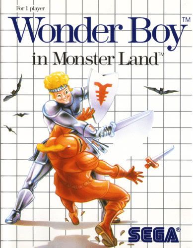
No console had more of a problem with bad box art than the Sega Master System, at least for the North American box art for it's games (the Japanese originals were usually awesome). Japanese box art for Sega games were pretty colorful and well, Japanese. For some reason with the American release of the Master System they decided to package games in really bland boxes with poorly drawn images over the same boring checkered background, I honestly believe that system would have sold better if the box art for it's games weren't so f*cking unappealing. It's not like they had some kind of budget problem, was finding good artists to do the artwork really that hard?
NES cover art was excellent. They had some really well done artwork and the early Nintendo developed games actually showed images from the game ON the cover. Why couldn't sega do the same for the MS?
I mean look at this.
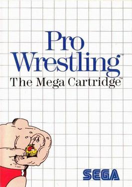
WTF is that? A wrestler holding his own head? What the hell is that all about?
Master System was a solid console but it's no wonder it didn't sell.

The Americanized box art for the Alex Kidd and Phantasy Star games were especially horrible. Like the old Mega Man artwork but even worse. I don't know why Anime-ish cover art was so unmarketable back then that they couldn't just use the same f*cking cover art.